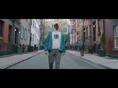
video directed and produced by Tristen Stafford

TUNAV NANDA & THE BDA
Tunav Nanda fought leuchemia and was granted his biggest wish by the Make-A-Wish Foundation to create his own shoe.
This became a reality thanks to Pensole Footwear Academy and Adidas US.
During the four-week-process of creating the color/material story and designing the shoe, I learnt about Tunav's disease, his look on life and his background. So for his shoe we decided to incorporate the three stages we saw as very significant to him and where he is today. This came to be the Before, During and After (cancer) - how it's affected his life and how it's given him life experience in a way that most people haven't had to endure by the young age of 20.
This came to be the BDA sneaker.

ADIDAS X PENSOLE X MAKE-A-WISH
The following project was a collaboration between Adidas US, Pensole footwear Academy and The Make-A-Wish Foundation. They came together due to a young man's fight against cancer and his wish to create his own shoe. Tunav Nanda was given the opportunity to create his own shoe at Pensole Footwear Academy together with D'Wayne Edwards as the footwear designer. I was brought in as the color/material designer on the project and was hereby given the opportunity to interpret Tunav's personal journey and stories through color and materials for his shoe.
A big thank you for the guidance and supervision from Suzette Henri,
D'Wayne Edwards, Wichaya Chantarasmee & the Adidas people for making it possible.

Tunav Nanda
gathering inspiration
For the stages of the before, during and after, I collected inspiration from different industries, books and web searches to get inspiration for surfaces, materials and colors. These all came from the initial talks I had with Tunav and so I looked into all sorts of industries such as classic craftsmanship, gastronomy and the space industry.
This came to be a large collection of imagery and items that all created inspiration to the following process where we had to 'boil it down' into three different yet cohesive stories that could all be applied to the shoe design and tell the stages of Tunavs life.
BUILDING THE BDA PALETTE
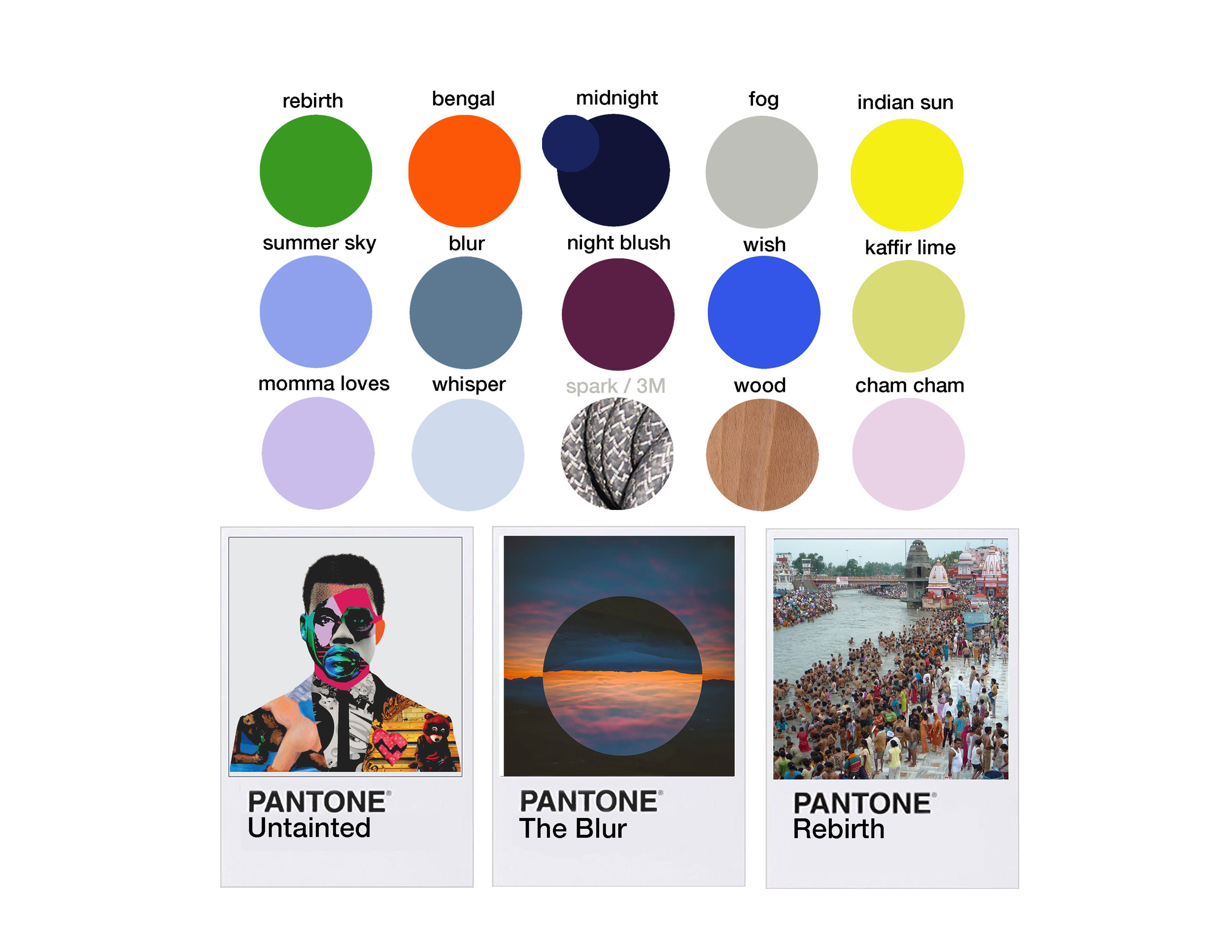
The three stories took their starting point from the above mentioned gathering on different inspiration sources. Revolving around the events in Tunav's life and the three stages of before, during and after cancer was transformed into "Untainted", "The Blur" and "Rebirth".
The color of orange came to be the hero-color-story because this color has a lot of meaning in Tunav's life. The three stages also needed to be able to intertwine. At the same time not melt into one another. This distinction came to be one of the harder parts of creating the pair. Taking into account that this was not to be an ordinary shoe going into retail nor being made in a unlimited amount, we wanted to take every opportunity we could get to make it stand out and tell the story to it's fullest.
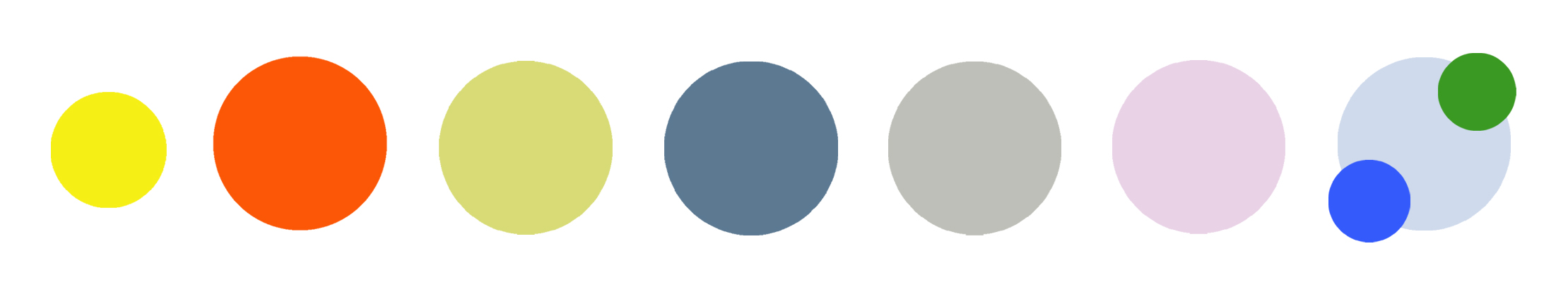
the story of before - "untainted"

All imagery that was not taken or produced by myself was for inspirational purposes only and non were incorporated onto the final product

The story representing the time before cancer
The moodboard seen above provided us with the inspiration for the story of before. The story of being untainted from the events that is about to happen. The time before Tunav was diagnosed with cancer, he lived a life where friends, family and an ongoing love for music and sneakers was what filled his life.
Growing up in New York, we wanted to incorporate some of the art scene here by Keith Harring along with imagery supporting the playfulness in this period of his life. The stroke of purple together with the collage-image and green sketch are all meant to describe the kid-like vibe and love for music and art. The colors are happy, somewhat naive and especially the combination of the purple/blue colors and orange were later used on the shoe because of it's complementary playfulness and vibrance - much like this era in Tunav's life it is meant to display fun and innocence.
the story of during - the blur


The story representing the time during cancer
The second story is during Tunav's leukemia and the chemo treatment. His description of the medication making him groggy and the years being somewhat of a blur, was something that we tried to incorporate into this moodboard.
The darkness of the images along with the picture of the surface of mars was to show the isolation and darkness of this period in his life. He wasn't able to live a normal life, be with his friends nor have a normal everyday life with his family. Instead he was in and out of hospital.
The importance of this period in Tunavs life was his determination to stay positive. That's why the strength of orange, the brightness of reflective 3M laces and the light at the end of the tunnel (see image) are all part of this board as well. A way to tell about the bright moments and the will to keep going and look forward.
the story of after - rebirth

the story representing the time after cancer
The third moodboard tells the story of Tunav's life after cancer. His Indian roots came up as he's visited India several times after being in remission. He told the story of the Ganges river and how this is a place to seek comfort, pray and wash of your sins. This third story came to be about newly found happiness - returning to his life in NY as well as his roots in India. Therefore the palette can be seen as a mix of India and NY. A happy palette yet more subdued to make it mature as Tunav had also aged within this period of time, obtaining knowledge about life in a way most 20 year olds haven't.
The orange is still at play, here being the color and strength of the Indian Bengal tiger resembling Tunav's strength and fight against cancer.
The orange is the hero color of all three stories due to it's immediate demand for attention when looking at it and the fact that it represents Tunav's look on the bright side of life. It is also the color of the leuchemia awareness ribbon which made the color seem even more relevant.
heather knit pattern process


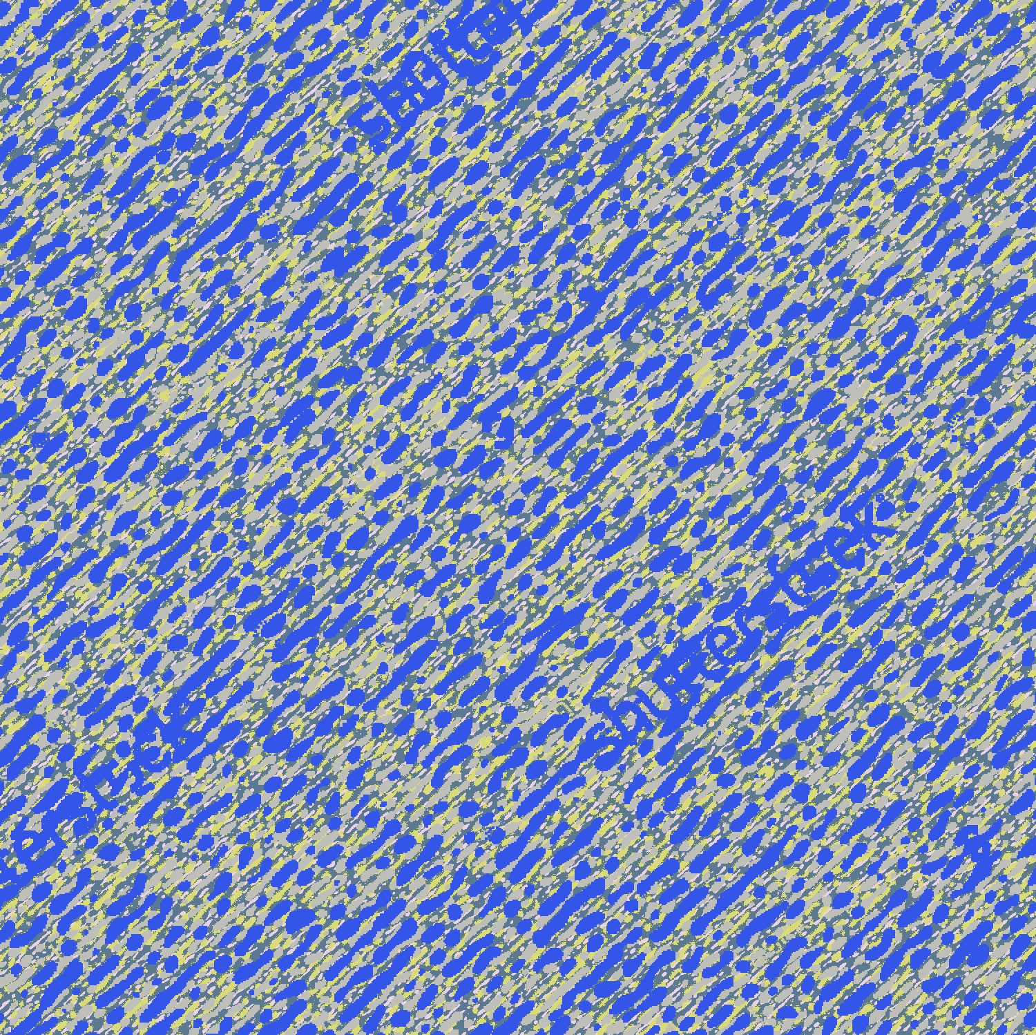
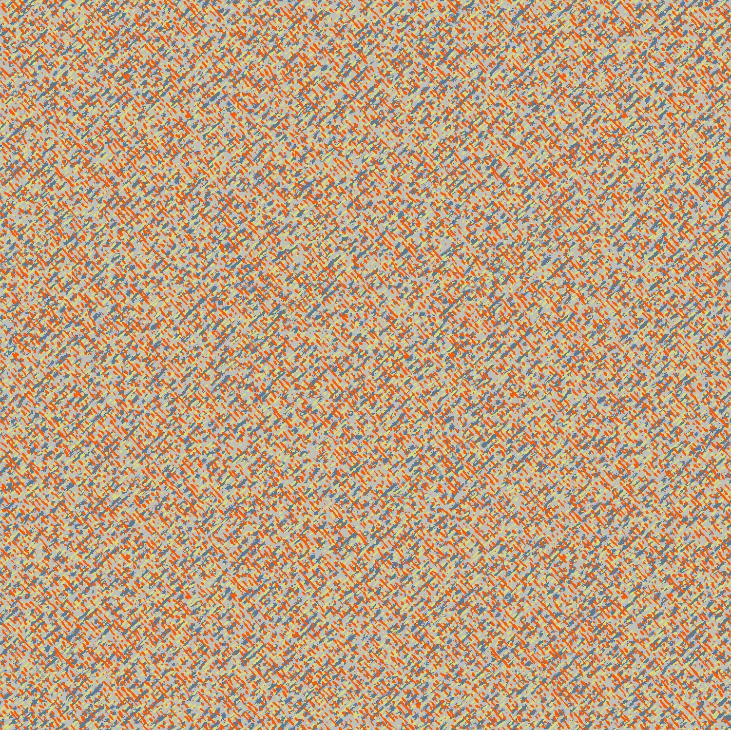


Developing the colorway into materials took some preparations of course. The main challenge was how to tell three stories and use as many of the different colors from the palette as we could within the design. We knew we had to go for a material and a technique that would give us the most color combinations to work with. Therefore we ended up settling on a heather-style knit for both laterals of the shoes, hereby creating space for having fun with different color-combos.
With my background in textiles I was considering how to make a surface in 2D to represent the vibrance and colors of the heather-knit that we were trying out.
Therefore I ended up creating my own repeat-patterns in different color combinations to quickly add to the otherwise flat sketch on the computer. Being use to tactility and wanting to see and feel the real material, it wasn't the same, yet it was a quick way to see color combinations and how different colors could work within a surface depending on the percentage of each color.
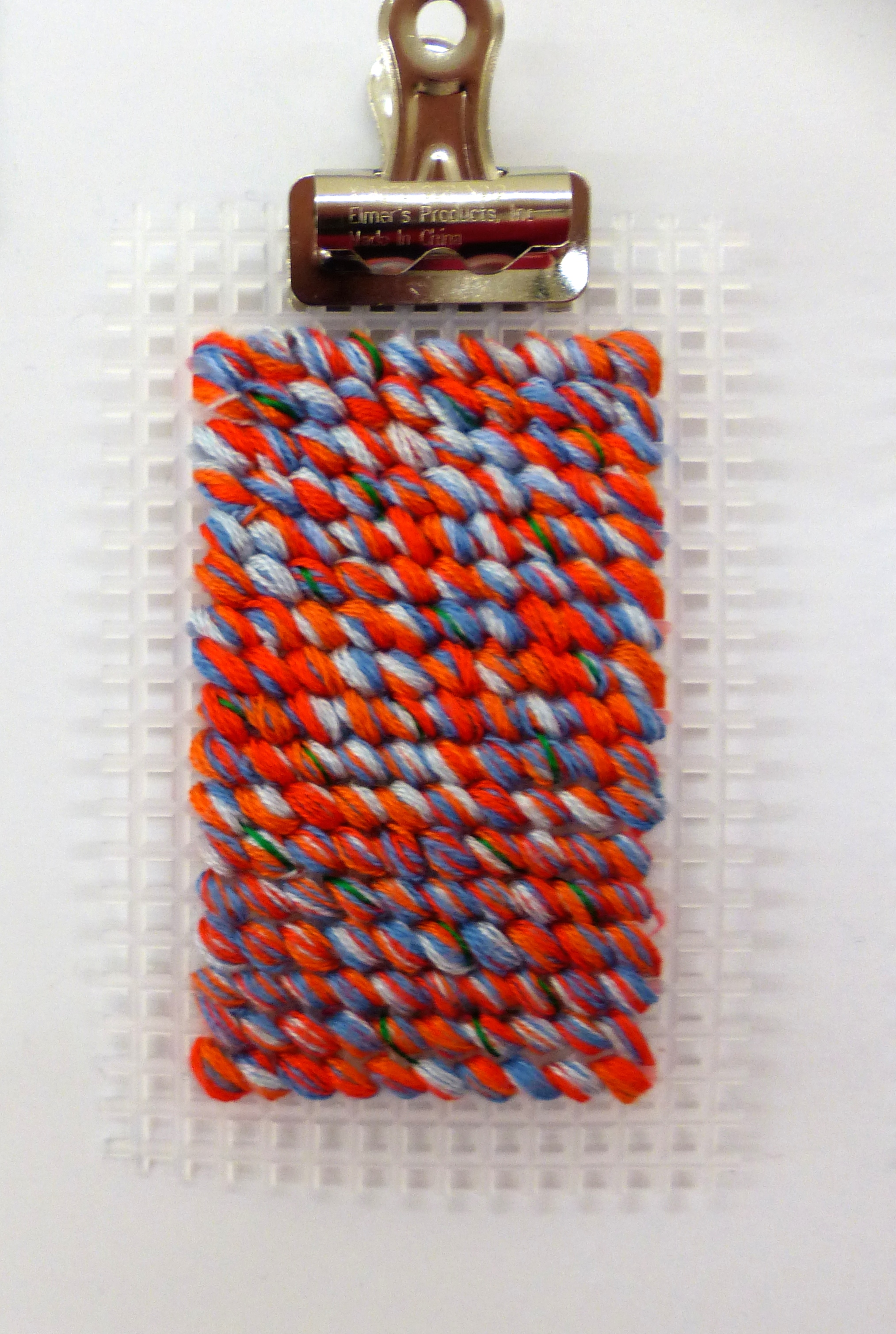
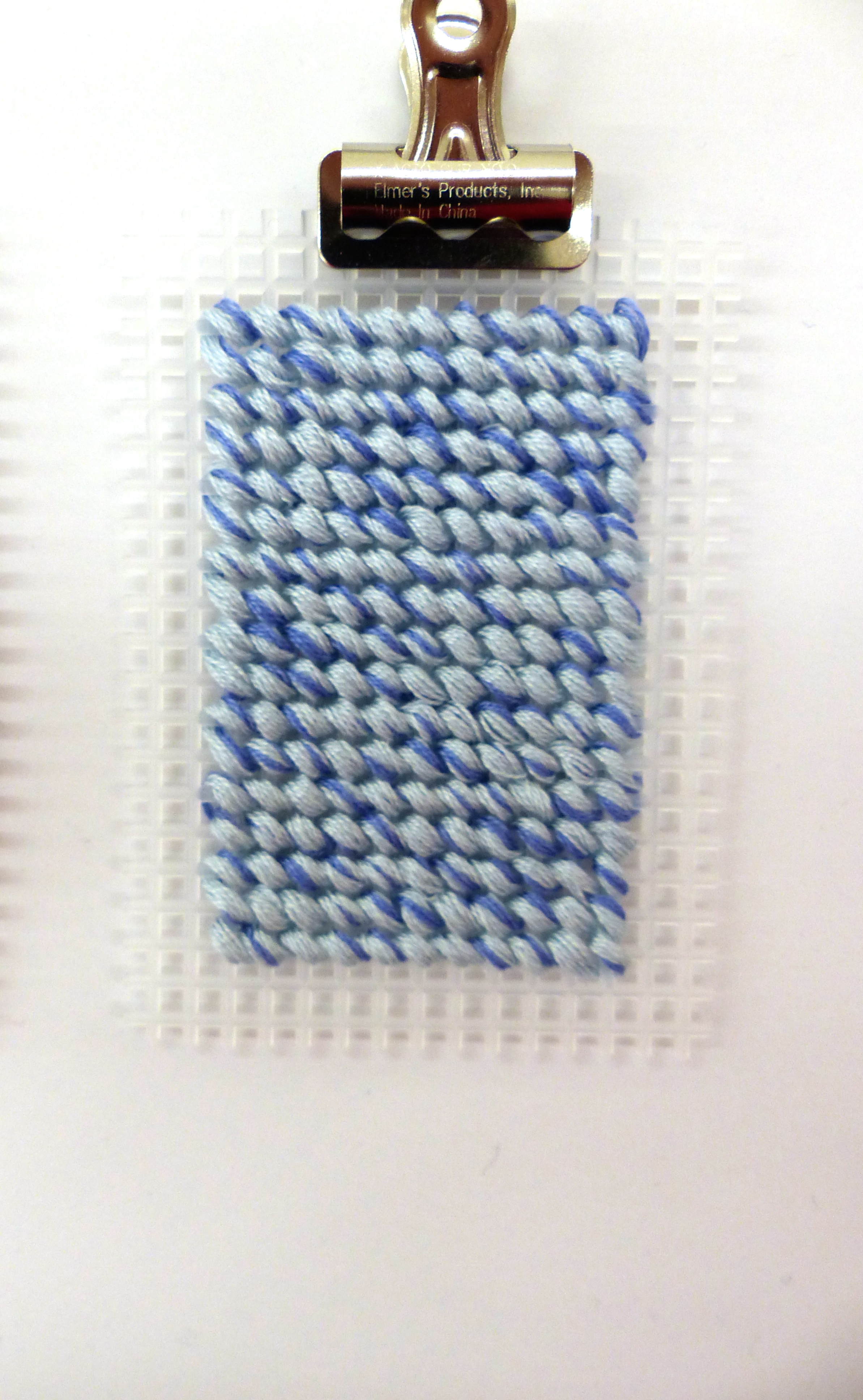
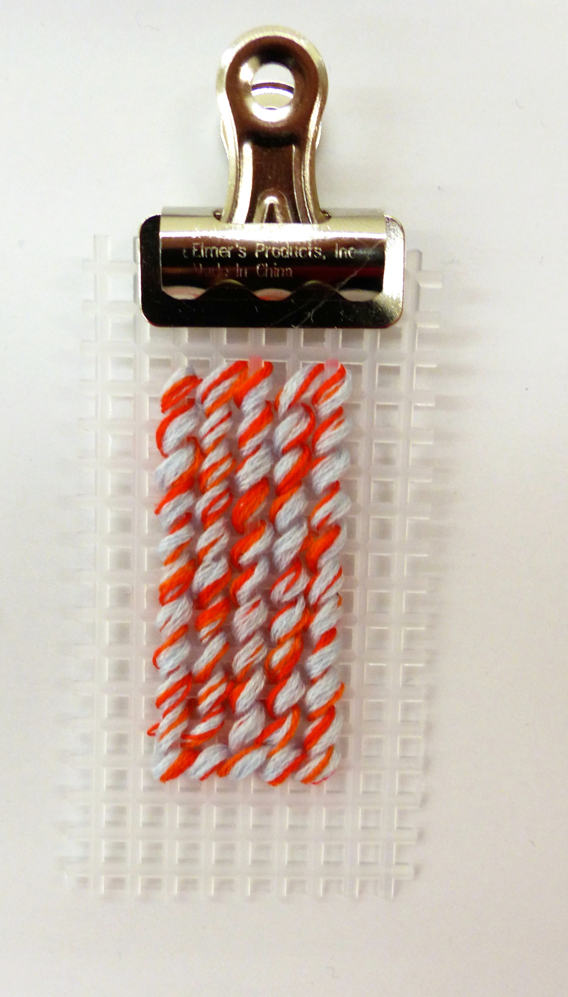
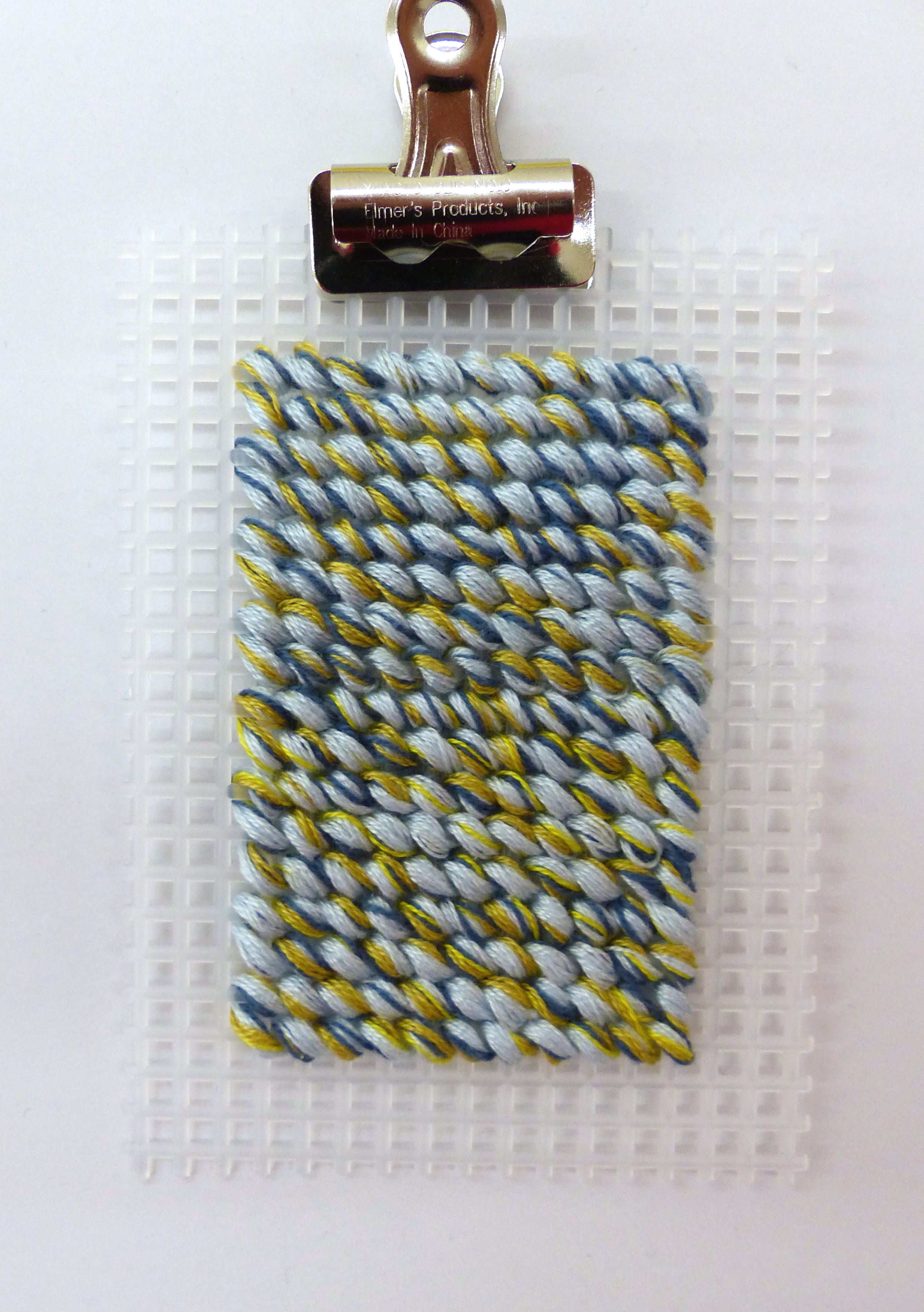

small dyeing samples I made at Pensole. Made from Adidas primeknit.
While experimenting with the 2D patterns on the computer I still felt I needed to communicate my idea of the heather-knit textiles in a more tangible manner. Something where you would under stand how the individual colors of the palette would come together within the different heather knit proposals. This was ideally meant as a tool to both discuss the colorway with Tunav and for myself to understand the proper amount of color needed to obtain the right look of what we decided upon for the final look of the shoe. It ended up also being one of the better ways to present the colorway for the final presentation.

As another experiment I stitched up different materials to visualize material combinations. This was both for inspirational purposes and to understand how a bespoke material like leather would work in combination with new technology based textiles such as TPU and heather knits.
placing color and story elements
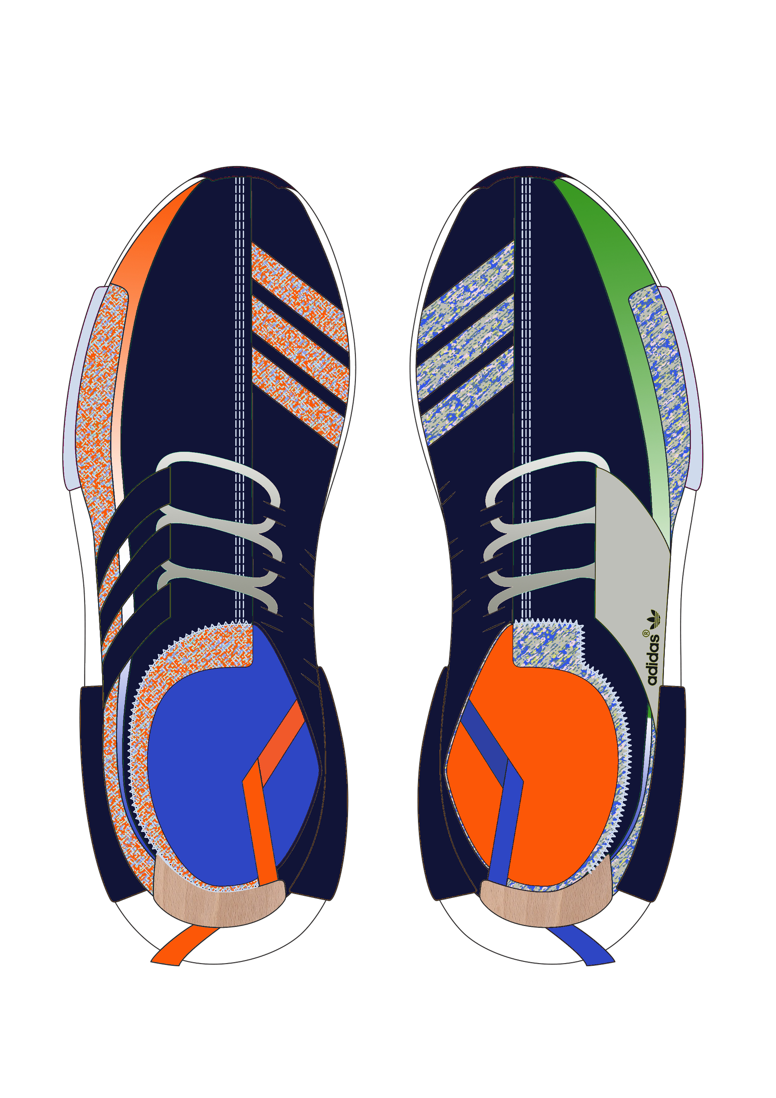
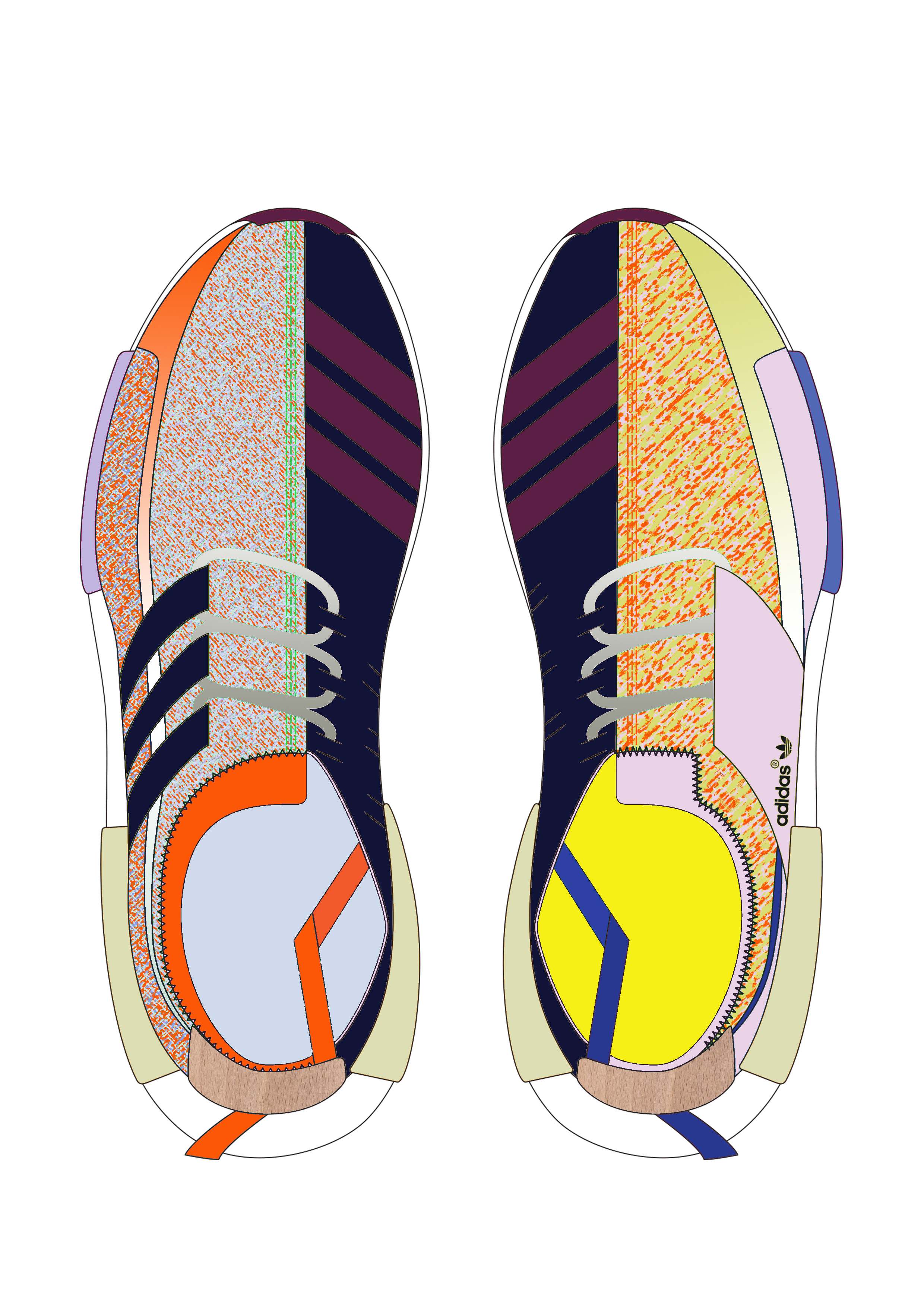


Above you see some of the many colorways I did in the process of finding the exact right one. As you can see more bright stories were also tried and a more complementary approach between the two shoes was something I experimented with quite a few of the shoes.
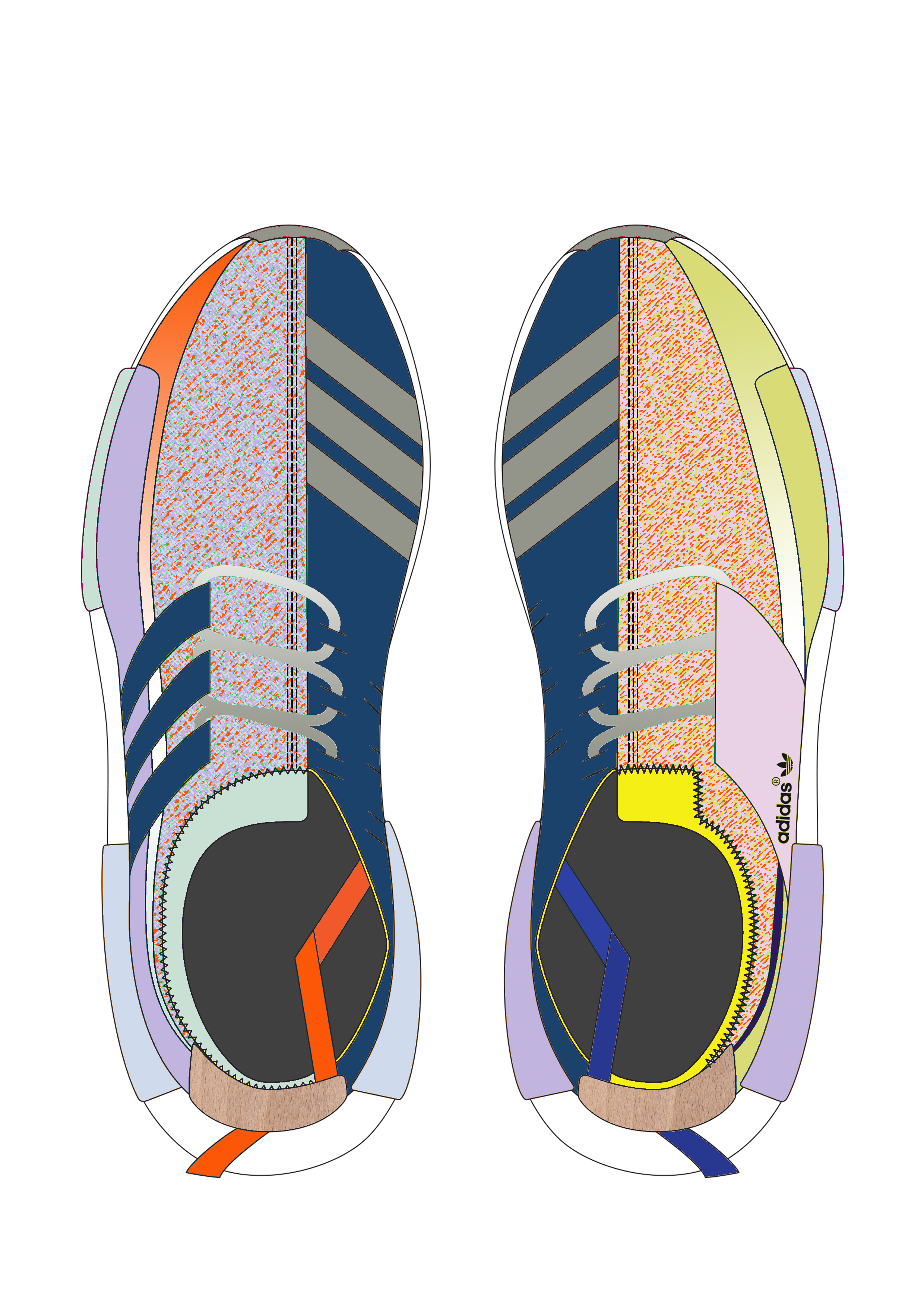
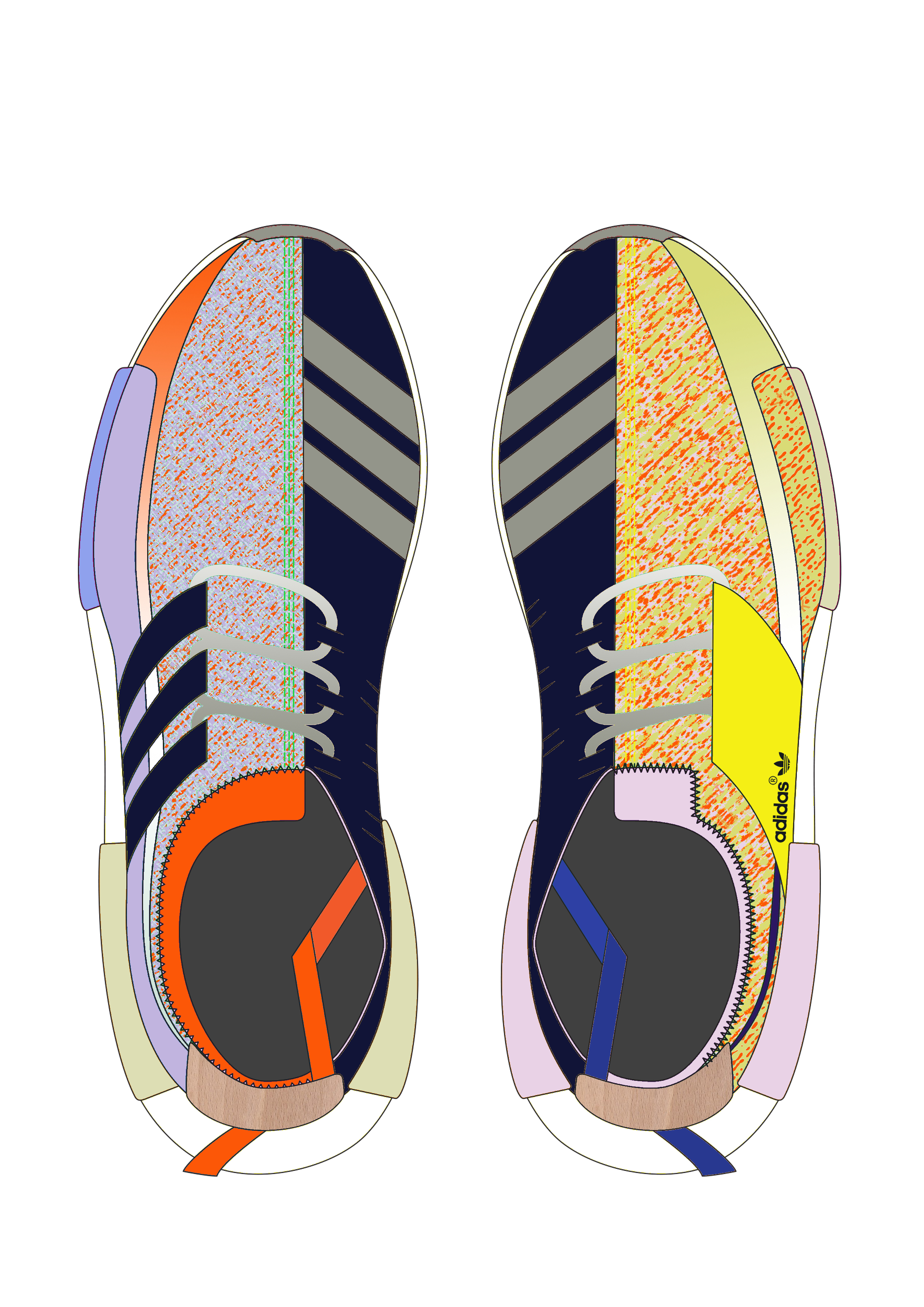
final design layout

The final CM proporsition for the BDA sneaker
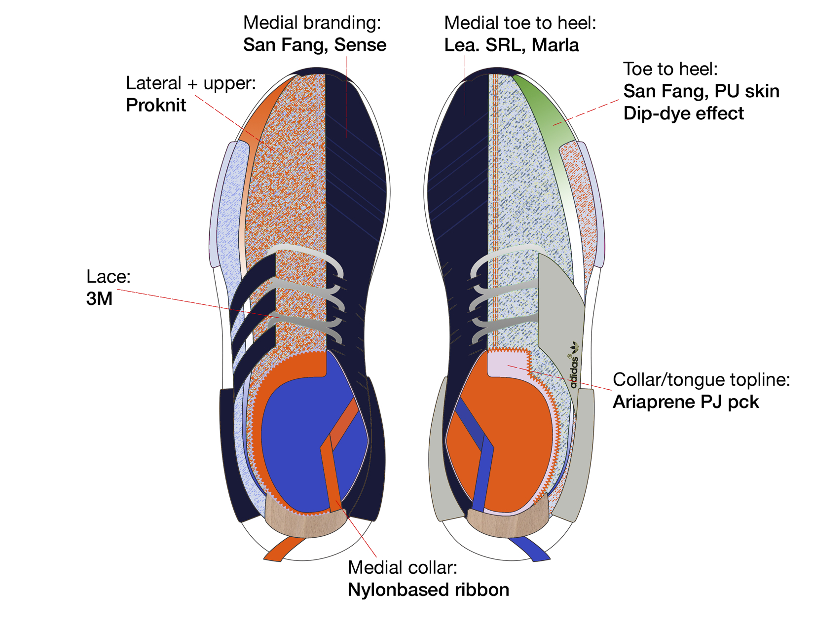
Now there is always a big process after the final design has been established. E.g. color-matching from idea to material, finding a heather-knit that is suitable etc. That's why I've chosen to call the above the final design layout. Below you will find a description of why the shoe came to look as it did in terms of both color and material choices:
On both laterals you'll see a colorful heather-knit, each representing different times in Tunav's life. On the left side we have "Untainted", the story representing the time before cancer. Here you'll see a use of complimentary colors, a way to resemble the playfulness and fun in this period of Tunav's life.
The medials of both shoes are made from a dark blue leather. Representing "The Blur" and the time of cancer, a tough material like leather seemed fit along with the dark and subtle color. On both medials you'll see the adidas branding slightly vague. This branding is to be made from a thermo-sensitive material that lights up when struck by sunlight/heat. This way it will resemble Tunav's belief of staying positive and finding the light within dark times of ones life. Making this shoe he wanted to inspire other children battling an illness and so this material with a transforming effect had the playfulness and surprising element that we wanted.
The right lateral of the BDA sneakers is representing the story of "Rebirth". The colors are more subdued yet the colorway light evoking a sense of maturity and happiness at the same time.
The blue and orange ribbon placed on the medials each represent their individual cause. The blue being the color of the Make-A-Wish Foundation while the orange is the awareness color for leukemia. The design of the shoe also hides many great details and stories of why the show came to look like it did and it both added opportunities and challenges to the color and materials work. It was a great task and having Tunav as the person for whom the shoe was being designed, it became a close teamwork of considering the best way to meet his vision for creating this shoe.
The shoes were launched and auctioned off in collaboration with the New York sneaker store Extra Butter:
https://extrabutterny.com/blogs/featured-presentations/pensole